


Introduction
Assessing an individual’s creditworthiness has always relied on a complex blend of financial, behavioral, and market-driven factors. These signals shift constantly, making manual prediction both time-consuming and inconsistent. Modern ML models offer lenders and underwriters a more scalable alternative providing fast, explainable, and maintainable credit insights that balance fair pricing for borrowers with profitable decisioning for institutions.
To ground these concepts in a real example, this case study explores mortgage pricing using Freddie Mac’s 2024 Q1 Single-Family Loan-Level Dataset. While external economic forces also influence rate accuracy, this dataset provides a strong foundation for demonstrating how an ML-driven pricing pipeline operates in practice.
How we will carry out our investigation:
- Data exploration
First Step is to understand the data we have, understand their correlations and any missing values. The overall objective of this phase is to simplify the data enough to its essence to help us with the feature engineering phase. - Feature Engineering
This stage will help to prepare the features we decide on for the model training phase. This is where we curate our dataset for the mortgage pricing model, selecting the most prominent features. - Model Training, Evaluation & GenAI
This is where the work so far comes together. Using the engineered feature set, we train and evaluate multiple machine learning models to identify the strongest performer. Each model is tracked through MLflow so we can compare accuracy, stability and overall fit.
Once the champion model is selected, we integrate it into a GenAI layer designed specifically for mortgage lenders. This final step transforms raw model outputs into tailored, easy-to-understand explanations that support real-time pricing conversations and decision-making.
Data Exploration
Before handing anything to a model, we need to get a feel for what the raw Freddie Mac data is actually telling us. This step is all about sanity-checking the dataset, understanding how rates are distributed, and seeing how the main drivers (credit score, LTV, DTI, etc.) behave.
Summary
- Dataset size: 214,929 records
- Total features: 31
Target variable – Interest Rate (%)
- Min: 2.250%
- Max: 9.250%
- Mean: 6.736%
- Std: 0.541%
From the histogram and box plot of interest rates, we can see that most loans are clustered tightly around the ~6.7% mark, with a relatively small spread (standard deviation just over half a percent). The distribution looks roughly bell-shaped with a slight right tail, which lines up with a few higher-rate outliers pushing towards 9% on the upper end and a handful of older/legacy low-rate loans on the lower end.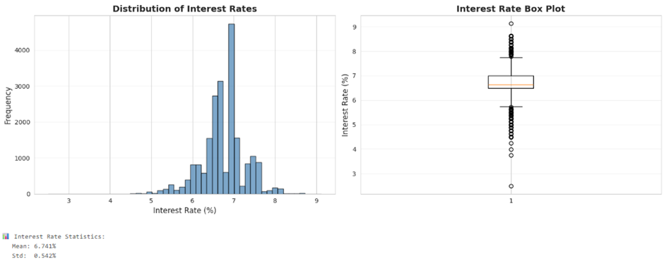
The box plot confirms this story, the interquartile range (IQR) is fairly narrow, meaning most borrowers are being priced in a tight band. There are visible outliers both below and above the main cluster. These are important to flag because they could represent special programs, data entry issues, or edge-case borrowers that may distort the model if we don’t handle them carefully. Next, we start looking at how some key features relate to rate:
- Credit Score vs Interest Rate:
The scatter shows the classic pattern we’d expect as credit scores improve, rates generally trend lower, but with noise. There are pockets where similar scores receive slightly different pricing, likely due to other risk factors (LTV, DTI, product type, etc.) that the model will eventually capture. For this this reducing the credit score axis would have yielded better visualisation. - LTV (Loan-to-Value) vs Interest Rate:
As LTV goes up (borrower has less equity), rates tend to creep higher. The scatter is more “cloud-like” than a sharp line, but you can still see a gentle upward slope at higher LTVs, especially close to 80–97% where risk is higher. - DTI (Debt-to-Income) vs Interest Rate:
DTI shows a similar soft relationship: higher DTIs are generally associated with slightly higher rates, but again with a lot of overlap in the middle. This tells us DTI matters, but it’s not the only thing driving pricing.
At this stage, the main takeaways are:
- Our target variable is well-behaved (no wild multimodal distribution, reasonable spread).
- Credit Score, LTV, and DTI all show meaningful but noisy relationships with rate, which makes them strong candidates for our feature set.
- We’ve identified outliers and potential edge cases that we’ll want to treat or at least track when we move into feature engineering and model training.
Feature Engineering
With the raw Freddie Mac tape explored, the next step is to reshape it into something a model can actually learn from. The aim here is simple: keep the economic story of the loan, strip away noise, and add structure where underwriters naturally think in buckets and interactions.
We start from the original loan-level fields and separate them into two groups: original features that we keep largely as-is, and engineered features that encode underwriting logic.
|
Feature Type |
Count |
Notes |
|
Original features |
11 |
Core credit, loan size, term, and high-level loan attributes |
|
Engineered features |
13 |
Risk score, interactions, buckets, and simplified categories |
|
Total (ex-target) |
24 |
Before final selection / pruning |
The feature engineering stage reduces the raw loan tape into a clean, structured view the model can learn from.
- Core numeric fields
credit_score, original_ltv, original_dti, original_upb, num_units and original_loan_term
These describe borrower strength, leverage and basic loan structure. - Core categorical fields
occupancy_status, property_type, loan_purpose and property_state
These define how the property is used and the context of the loan. - Engineered risk features
risk_score, ltv_dti_interaction, credit_ltv_interaction and loan_per_unit
These capture how multiple risk factors combine and help the model recognise higher-risk profiles. - Category groupings
credit_score_category, ltv_category, dti_category and loan_size_category
These reflect the breakpoints underwriters use in real pricing decisions. - Simplified label fields
property_type_simple, occupancy_simple and loan_purpose_simple
These reduce complexity while keeping economic meaning. - Timing features
first_payment_year and first_payment_quarter
These help the model learn changes in market conditions over time.
Once combined, these features form a final set of 20 predictors plus the target original_interest_rate. After removing any remaining nulls, the dataset is saved as a Delta table and becomes the foundation for model training.
|
Final Modeling Dataset |
Value |
|
Records |
214,929 |
|
Features (predictors) |
20 |
|
Target |
original_interest_rate |
|
Table name |
mortgage_data_features |
This gives us a compact, model-ready view of each loan that still feels very close to how a human underwriter would describe the file.
Correlation Analysis – What Drives Rate?
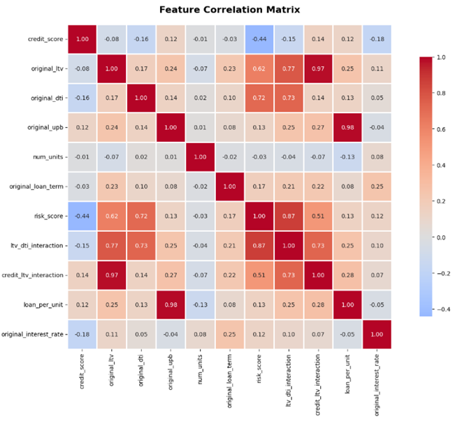
Before throwing models at the data, it’s worth sanity-checking how these features move with the interest rate. The simple Pearson correlations with original_interest_rate look like this:
|
Feature |
Correlation with Rate |
|
original_loan_term |
+0.251 |
|
risk_score |
+0.124 |
|
original_ltv |
+0.114 |
|
ltv_dti_interaction |
+0.098 |
|
num_units |
+0.078 |
|
credit_ltv_interaction |
+0.073 |
|
original_dti |
+0.046 |
|
original_upb |
−0.037 |
|
loan_per_unit |
−0.046 |
|
credit_score |
−0.184 |
The picture is reassuring. Longer terms tend to price higher, which comes through as the strongest direct linear relationship. Credit score behaves exactly as expected: as scores improve, rates come down, giving us a clear negative correlation.
Leverage and affordability show up with positive correlations: higher original_ltv, higher original_dti and, more importantly, their interaction ltv_dti_interaction all point towards higher pricing. The interaction terms are doing what they were designed to do, highlight the stacked-risk files where a borrower is both highly leveraged and already carrying a heavy debt load. risk_score pulls these ingredients together, and the positive correlation with rate confirms that this composite view is aligned with the way loans are priced.
Overall, the correlation analysis tells us two important things:
- the engineered features behave in a way that matches domain intuition; and
- no single feature completely dominates the target, leaving room for the model to pick up richer, non-linear combinations.
With feature engineering complete and the relationships to rate looking sensible, we’re in a good position to move on to the model training and MLflow tracking phase.
Model Training, Evaluation & GenAI
Model Training
Prepare features and target variables, handle categorical encoding, and create train/test splits.
|
# Define feature groups numeric_features = [ 'credit_score','original_ltv', 'original_dti', 'original_upb','num_units','original_loan_term','risk_score','ltv_dti_interaction','credit_ltv_interaction','loan_per_unit' ] categorical_features = [ 'credit_score_category','loan_size_category','ltv_category','dti_category','property_type_simple','occupancy_simple','loan_purpose_simple','property_state']
temporal_features = [ 'first_payment_year','first_payment_quarter']
target = 'original_interest_rate' len(temporal_features)}")
# Create feature dataframe X = df[numeric_features + categorical_features + temporal_features].copy() y = df[target].copy() |
Split data into training (80%) and testing (20%) sets ensuring balanced representation.
|
# Train-test split with random state for reproducibility X_train, X_test, y_train, y_test = train_test_split( X, y, test_size=0.2, random_state=42 ) |
Then setup MLflow experiment
Initialise MLflow experiment tracking to log all model training runs, parameters, metrics and artifacts.
|
# Set MLflow experiment experiment_name = "/Users/xxxxx/mortgage_pricing_models" # Try to create experiment, or use existing try: experiment_id = mlflow.create_experiment(experiment_name) print(f"✅ Created new experiment: {experiment_name}") except: experiment = mlflow.get_experiment_by_name(experiment_name) experiment_id = experiment.experiment_id print(f"✅ Using existing experiment: {experiment_name}")
mlflow.set_experiment(experiment_name)
print(f" Experiment ID: {experiment_id}") print(f"\n📊 All runs will be tracked in MLflow UI") print(f" Access at: https://{your_url}/ml/experiments/{experiment_id}") ) |
Evaluation
For the MLflow experiment I compared three models for predicting mortgage interest rates: a baseline Linear Regression, and two gradient boosting models, XGBoost and LightGBM. MLflow was used to track runs, metrics and parameters so we could pick a champion model based on out-of-sample performance.
|
Model |
Test RMSE |
Test MAE |
Test R² |
Test MAPE (%) |
|
XGBoost |
0.468013 |
0.357783 |
0.261302 |
5.417410 |
|
LightGBM |
0.468177 |
0.357707 |
0.260783 |
5.416796 |
|
Linear Regression |
0.503227 |
0.385939 |
0.145956 |
5.828756 |
XGBoost edges out the others with the lowest Root Mean Squere Error (RMSE) and Mean Absolute Error (MAE) and the highest R², so it is selected as the champion model. The difference between XGBoost and LightGBM is extremely small and not practically meaningful, but both clearly outperform the linear baseline, which struggles to capture the complexity in the pricing relationships.
Practical impact of model accuracy
- XGBoost’s MAE of ~0.36 percentage points means that, for a typical 6.5% mortgage rate, the model is usually within ±0.36% of the actual rate.
- With an RMSE of ~0.47, most predictions fall within roughly ±0.9–1.0 percentage points of the true rate.
- On a $300,000 mortgage, a 0.36% error equates to around $65 per month difference in payment.
- This level of accuracy is good enough for preliminary pricing and underwriting discussions, while still leaving room for a human underwriter to fine-tune the final offer.
Limitations and what the model misses
- An R² of 0.26 shows that the model explains only about 26% of the variation in interest rates.
- The remaining 74% is likely driven by factors not captured in this dataset, such as:
- real-time market conditions (e.g. bond yields, macro signals),
- lender-specific pricing overlays and strategy,
- local negotiation and competitive behaviour,
- and long-term borrower relationship history.
- This underlines that the model is a decision support tool, not a full replacement for pricing desks, credit policy, or human judgment.
The reason the gradient boosting models outperform Linear Regression comes down to how mortgage pricing really works. The relationship between credit score, LTV, DTI and rate is highly non-linear and full of thresholds: a small change around an 80% LTV or a particular FICO band can move the price more than a simple linear slope would suggest. Gradient boosting handles these kinks and feature interactions naturally, whereas a linear model can only fit straight lines unless we manually engineer a large number of interaction and non-linear terms.
Overall, the takeaway from this MLflow run is that our dataset needs to expand beyond the current features to use external sources to help with our accuracy, however our model particularly XGBoost provides a solid, business-interpretable starting point for a mortgage pricing engine: accurate enough to guide offers, transparent enough to monitor, and still complemented by human oversight for final rate setting.
Explainable Pricing with SHAP & GenAI
To move beyond “black box” predictions, we add an explainability layer on top of the XGBoost model. This combines SHAP values for technical transparency with a GenAI chat interface that turns those numbers into human language for brokers and borrowers.
SHAP-Based Explainability
SHAP (SHapley Additive exPlanations) values quantify how each feature pushes a prediction up or down relative to the portfolio average rate. For our XGBoost model, SHAP lets us see both global patterns and the story behind a single quote.
- At the portfolio level, SHAP highlights the features that most consistently move pricing: LTV, credit score, DTI, occupancy, loan purpose and term.
- At the individual loan level, each prediction is decomposed into a base rate (6.736% in this dataset) plus a series of feature contributions that sum to the final quoted rate.
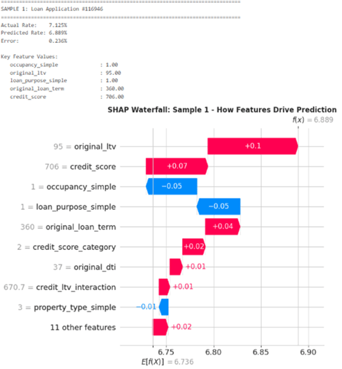
To show how this works in practice, we walk through three real loan applications. In each case, the model starts from the average rate of 6.736% and then adjusts up or down based on the borrower profile.
Sample 1 – High LTV, standard owner-occupied file
The predicted rate is 6.889%, about 0.15% above the base rate. The main upward pressure comes from a 95% LTV and a mid-tier credit score around 706, both of which increase perceived risk. This is partially offset by the loan being owner-occupied with a standard purpose and a 360-month term, which pull the rate back down a little. Overall, this is priced as a higher-risk, high-leverage loan with some positive mitigating factors.
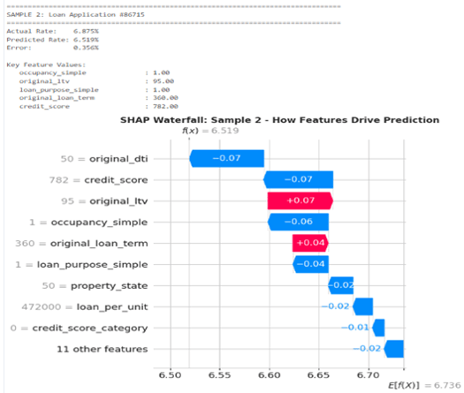
Sample 2 – Strong borrower offsetting high LTV
Here the model predicts 6.519%, roughly 0.22% below the base rate. The borrower’s DTI of 50% and excellent credit score of 782 both have strong negative SHAP values, reducing the rate. Although the LTV is again 95% and the term is 360 months, which push the rate up, the combination of very strong credit and behaviourally acceptable DTI more than compensates, leading to a cheaper rate than average.
Together, these examples show that the model’s behaviour is consistent with underwriting intuition: riskier leverage and purposes push rates up; strong credit, equity and owner-occupancy pull them down.
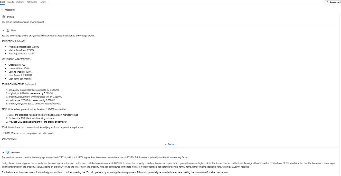
GenAI-Powered Explainability Layer
SHAP gives us numbers and charts; the final step is to turn those into explanations a broker can read in a few seconds and repeat to a customer. For that, we add a GenAI layer on top of the XGBoost + SHAP pipeline.
The workflow is:
- For each pricing request, we take the predicted rate, base rate and top SHAP features (values and impacts).
- These are passed into a prompted Large Language Model (LLM), which is instructed to write a short, professional explanation: what rate was predicted, the main reasons it’s above or below the market base rate, and one actionable suggestion (for example, “reducing the LTV by increasing the deposit could lower the rate”).
- The generated text is returned to the pricing application and stored as an MLflow artifact so that explanations are auditable and reproducible.
This turns the model into a conversational tool: a broker can request a quote, immediately see the numerical breakdown, and also receive a ready-made explanation that is consistent, compliant and easy to share with the borrower.
Conclusion
Together, the ML pricing model, SHAP explainability and the GenAI explanation layer give us a pricing system that is accurate, transparent and ready for real-world use. It allows brokers, auditors and borrowers to understand not just the rate, but the reasoning behind it, turning intelligent pricing into a clear, confident part of the lending process.